
In 2018, I was working with the Land Transport Authority of Singapore on a transit accessibility project. One of my colleagues, a senior GIS expert with decades of experience, walked me through a methodology called PTAL: Public Transport Accessibility Level. It scores every point in a city based on how long it actually takes to walk to a bus stop and how often buses come. Singapore used it to make infrastructure investment decisions at a block-by-block level.
I was fascinated. I wanted to do the same thing for my neighbourhood in York Region, Canada.
Then I went home and realised I had no practical way to do it. I'm not a GIS analyst. I'm a Gen AI Architect. The methodology made sense to me — the data sources were all open and available — but translating that knowledge into working code and GIS layers was a different problem entirely. That gap sat with me for six years.
Last weekend I finally closed it — using QGIS MCP and Claude CLI over a Saturday and Sunday.
What QGIS MCP Made Possible
QGIS is the open-source GIS platform used by planners and analysts around the world. MCP — Model Context Protocol — is a standard that lets AI assistants connect directly to external tools and act within them. With the QGIS MCP plugin and Claude CLI, I could describe what I wanted in plain language and have the AI write and execute the analysis code directly inside my QGIS session — not in a separate notebook, not copy-pasted from a chat window, but live, in the tool, with full visibility into what was happening.
What I found — across a Saturday and Sunday — was that my knowledge from Singapore was the missing piece the AI needed. I knew what PTAL should produce. I knew which routing decisions mattered. I knew what "wrong" looked like on the map and could say so. The AI knew how to translate those requirements into PyQGIS code, network graph algorithms and spatial joins.
What I Built
Over a 12km × 12km study area centred on Markham, I built a transit accessibility pipeline using entirely open data.
The walking network
Starting with an OpenStreetMap extract, Claude ran a full feature breakdown across all 34,648 road and path segments in the area — identifying which were walkable and assigning each a cost weight:
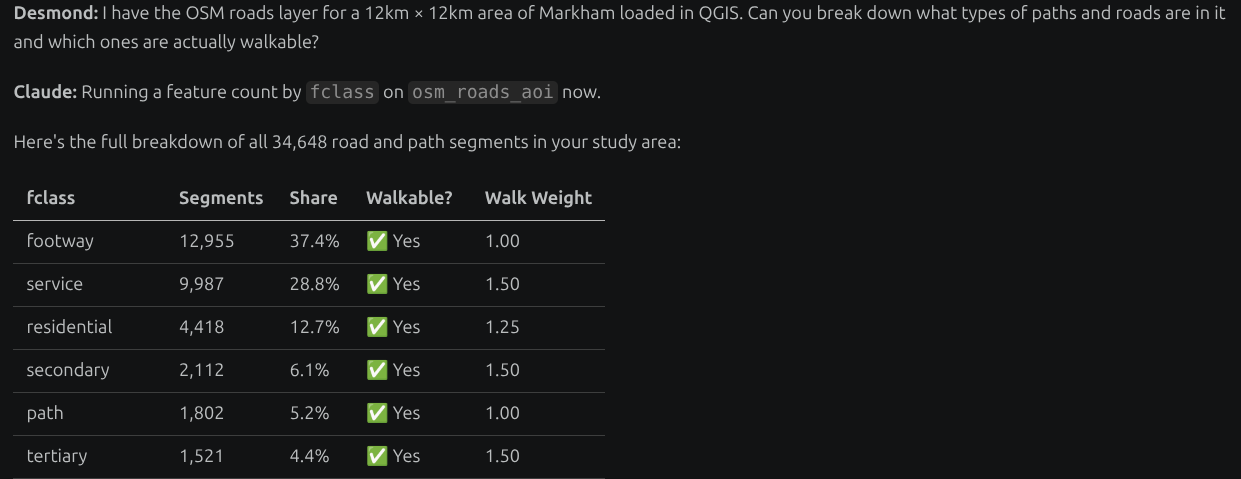
After filtering out motorways, motorway links, and busways, the clean walkable network came to 34,105 segments. Dedicated footways get a cost weight of 1.0 — preferred. Walking along a primary road gets 1.5 — slower and less comfortable, especially in a Canadian winter. This weighting logic was proposed and implemented by Claude in a custom QgsNetworkStrategy subclass, tuned to Canadian conditions where footpaths are plowed but arterial sidewalks often aren't.
The catchment and stop data
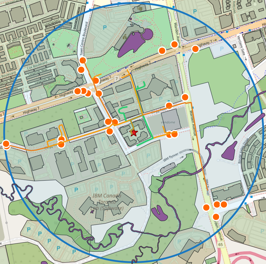
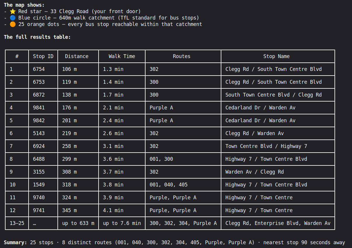
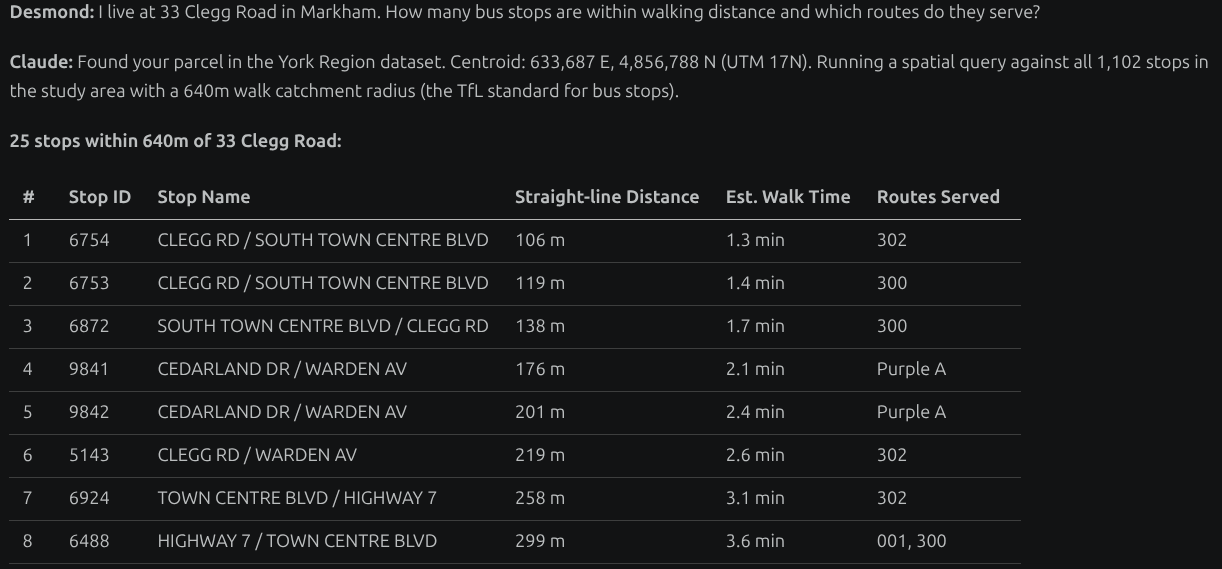
York Region Transit GTFS data provided every bus departure at every stop, used to calculate how often each route runs and the average wait time. The map below shows the 640m walk catchment radius (the TfL standard for bus stops) from a single origin point in Markham Town Centre — with 25 stops reachable and 8 distinct routes:
Walk time isochrones
The PTAL formula itself combines walking time to each stop with the service frequency at that stop, producing an Accessibility Index (AI) that feeds into a score from 1a (very poor) to 6b (outstanding). Every 200-metre grid cell across the study area gets its own score. The walk-time isochrones visualise exactly how far you can walk in a given number of minutes from any origin point:
When Domain Knowledge Saved the Analysis
Midway through the weekend, a routing result looked wrong. There was a footpath I could see clearly on the map connecting to a stop — but the router wasn't using it. Here's the actual conversation that caught it:
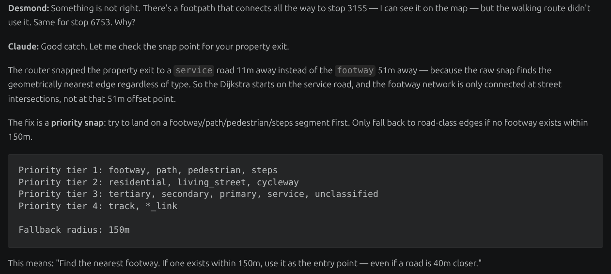
The problem: the router was snapping the property exit to a service road 11m away instead of the footway 51m away — geometrically nearest, but wrong. Claude implemented a priority snap that preferentially connects to footway-class segments first, even if a road is geometrically closer.
This exchange is the pattern. I knew something was wrong because I know how people actually walk through my neighbourhood. Claude knew how to diagnose and fix it at the network graph level.
The Hidden Finding: Paths That Go Nowhere
The topology analysis revealed something unexpected. Of the 19,318 pedestrian path segments in the study area, 2,063 are completely isolated — they connect to nothing. Not because they don't exist on the ground, but because of OSM digitising gaps: two segments that look connected on a map but whose endpoints are 1–5m apart, so the router treats them as disconnected.
This Is Just the Beginning
The full PTAL heatmap for York Region — not just one neighbourhood, but the entire region — is what I'm building toward. And Canada presents a challenge that London's original methodology never had to consider.
Some of those weighted walking paths? They're unusable from November to March. The PTAL score for a block in July and the PTAL score for the same block in February are not the same number. That analysis is coming.
The Bigger Point
The GIS expert in Singapore who taught me this methodology had decades of experience. The gap between what he knew and what I could execute on my own was enormous.
That gap is closing.
Not because AI replaces GIS expertise — it doesn't. The routing decisions, the methodological choices, the sanity checks against what I know about how people actually walk through my neighbourhood: all of that required my domain knowledge from Singapore, not a prompt. But the translation from "I know what this should produce" to "it is producing it" — that part is now available to people who aren't career GIS specialists.
For planners, policy analysts and domain experts who have always wanted to do this kind of work but lacked the technical path to get there: the path is shorter than it used to be.
In the AI era, knowing the problem beats knowing the tool. This is mine. What's yours?
Tools: QGIS, QGIS MCP plugin, Claude CLI (Anthropic), OpenStreetMap, York Region Transit GTFS, York Region Open Data. Study area: 12km × 12km centred on Markham Town Centre, NAD83 UTM 17N.
If you're working on urban planning, transit accessibility, or similar geospatial projects and want to compare notes — get in touch.